Admin Portal – AHA
Product Design
UI / UX Design
Admin Portal— Case Study from the Organization — American Heart Association (Heart.org)
This UX case study provides a detailed overview of the steps taken to redesign the Super Admin Portal of the Professional Educational Hub—a platform that enables administrators to manage users, course categories, and featured showcases. The previous version of the portal faced significant usability challenges, making it difficult for Super Admins to efficiently handle essential administrative tasks such as user role management, content organization, and system configurations.
Hima Chandrashekaraiah Prabha
Introduction
As a Senior UX Designer, I was responsible for redesigning the Super Admin Portal of the Professional Educational Hub, a platform used to manage users, courses, categories, and showcases. The redesign aimed to improve usability, efficiency and accessibility for Super Admins, ensuring seamless platform management.
Discovery Phase
Understanding the Problem
To kick off the redesign of the Admin Portal, we focused on gaining a clear understanding of the issues in the current MVP. Key findings included:
- Inconsistent Design Elements: The interface suffered from visual mismatches—fonts, colors and component styles varied across the portal.
- Poor Visual Hierarchy: Users struggled to distinguish between primary and secondary actions, leading to confusion and inefficiency.
- Lack of Best Practices: The portal did not align with modern UX patterns seen in competing platforms.
- Feature Gaps: Several valuable functionalities were missing, which limited user engagement and administrative efficiency.
These insights laid the groundwork for targeted UX improvements and informed the direction of the next phase—user research.
UX Process
I structured my UX process around secondary research, heuristic evaluation, usability principles and stakeholder collaboration.
01
📌 Understanding the Business Goals
- Conducted stakeholder interviews with BAs, POs, and PMs to understand business objectives, KPIs, and pain points.
- Analyzed product documentation to learn about the existing system.
02
📌 Competitor & Industry Analysis
- Researched best practices in admin panel design across educational platforms like Coursera, Udemy, and Moodle.
- Conducted benchmarking analysis to compare UI patterns, features, and navigation structures.
03
📌 Heuristic Evaluation
I conducted a heuristic evaluation based on Nielsen’s 10 Usability Heuristics to identify usability flaws

Defining UX Strategy & IA
📌 Stakeholder Workshops
Conducted workshops with Business Analysts (BAs) and Product Managers (PMs) to collect indirect user insights. These sessions helped us review past research and tap into internal knowledge, providing valuable context for understanding user pain points and shaping the redesign strategy.
📌 Jobs-to-Be-Done (JTBD) Framework
Super Admin
- Researched best practices in admin panel design across educational platforms like Coursera, Udemy
- Job: Ensure secure user management and system stability.
- Pain Points: Complex permissions, security risks.
- Desired Outcome: Automated, streamlined user management
Old Information Architecture (IA) Issues
🔍 Poor Navigation & Findability
❌ Confusing Menu Structure – Users struggle to locate courses or settings.
🔄 Too Many Clicks – Essential features buried under multiple layers.
🔎 Weak Search Function – No filters, irrelevant results, or missing keywords.
📊 Ineffective Dashboard & Insights
🏃 Slow Performance – Large dashboards slow down platform responsiveness.
📊 Overwhelming Data Dump – Too much information without clear prioritization.
🛑 No Actionable Insights – Users struggle to interpret engagement data.
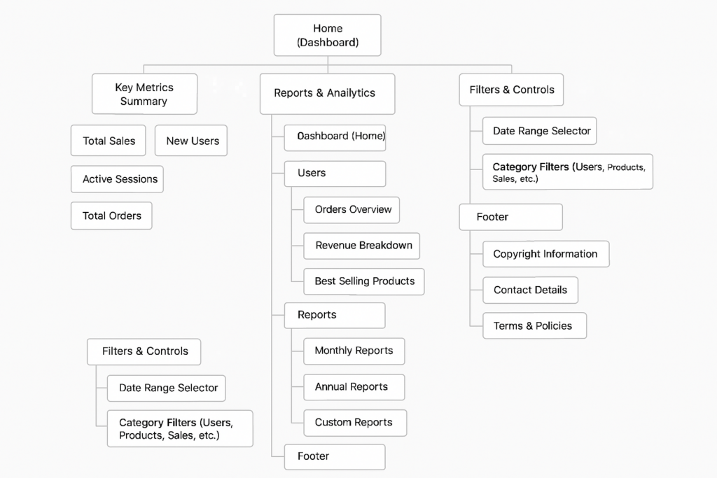
Information Architecture (IA) Redesign
The previous IA was cluttered, with deep navigation levels. I proposed a simplified structure, making it:
✅ Task-Oriented – Grouped features based on user tasks.
✅ Flat Hierarchy – Reduced unnecessary nesting.
✅ Logical Categorization – Clear sections for User Management, Course Management, Showcase Management, and Settings.
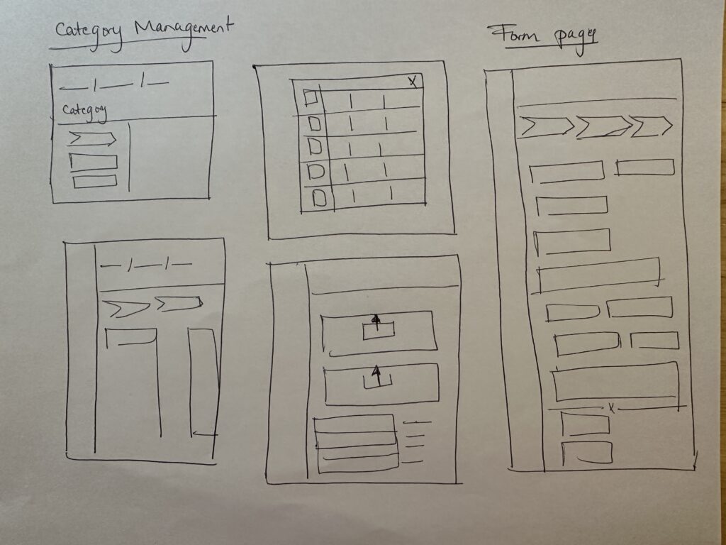
Wireframes
Created quick sketches and low-fidelity wireframes using Figma.
Focused on layout restructuring and better task grouping.


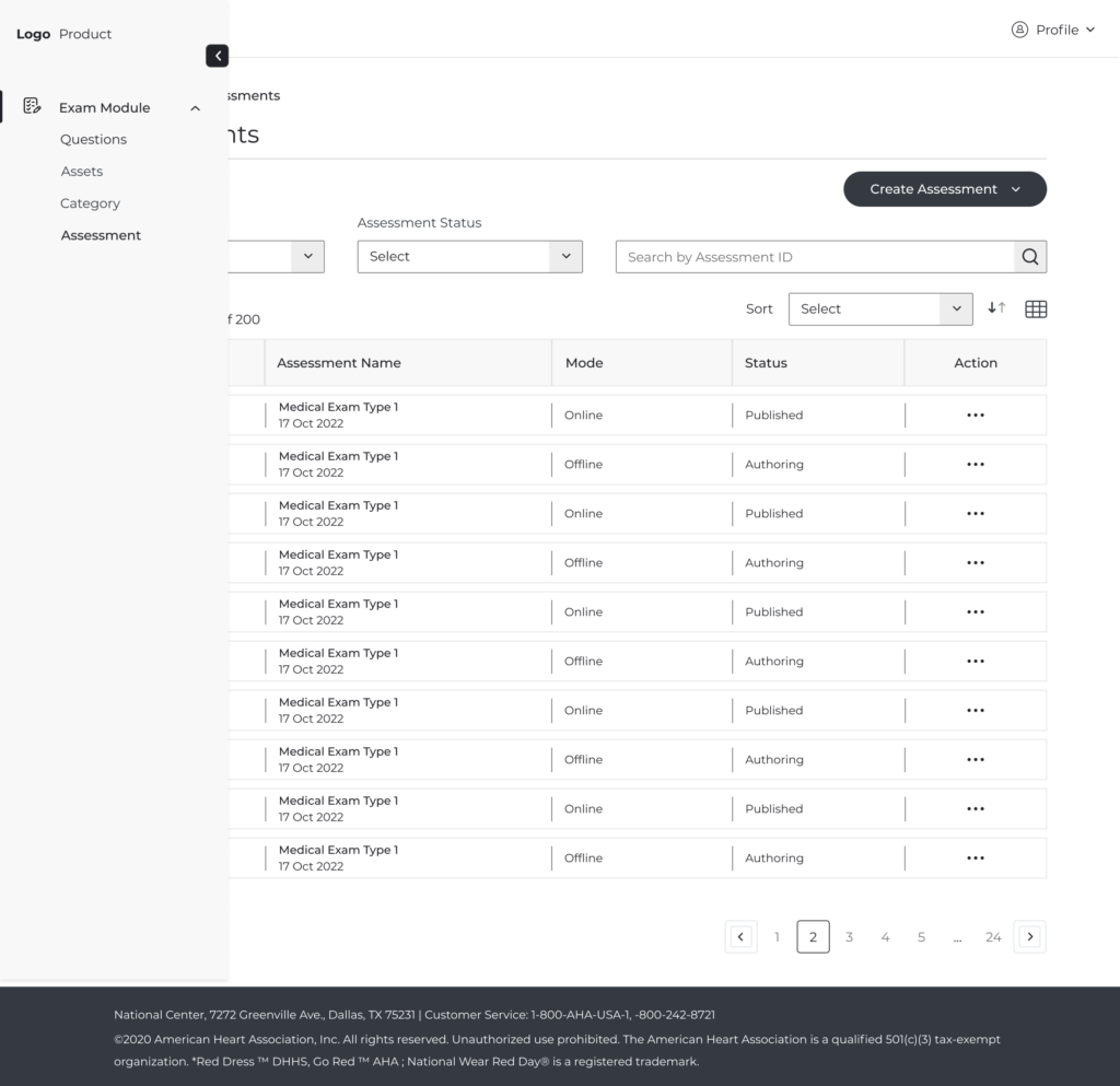
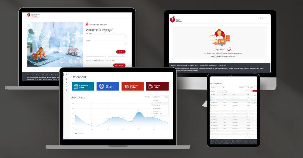
High Fidelity
Prototypes
Developed clickable prototypes with streamlined workflows for user management, category organization, and showcase updates.
Ensured accessibility compliance (WCAG) for color contrast, readability, and navigation.
Validation & Iteration
Stakeholder Feedback Sessions
Since end-user testing wasn’t possible, I conducted usability reviews with BAs, POs and PMs to ensure the redesign met business and user needs
A/B Testing with Internal Teams
- Ran A/B tests on two dashboard layouts to determine which improved efficiency.
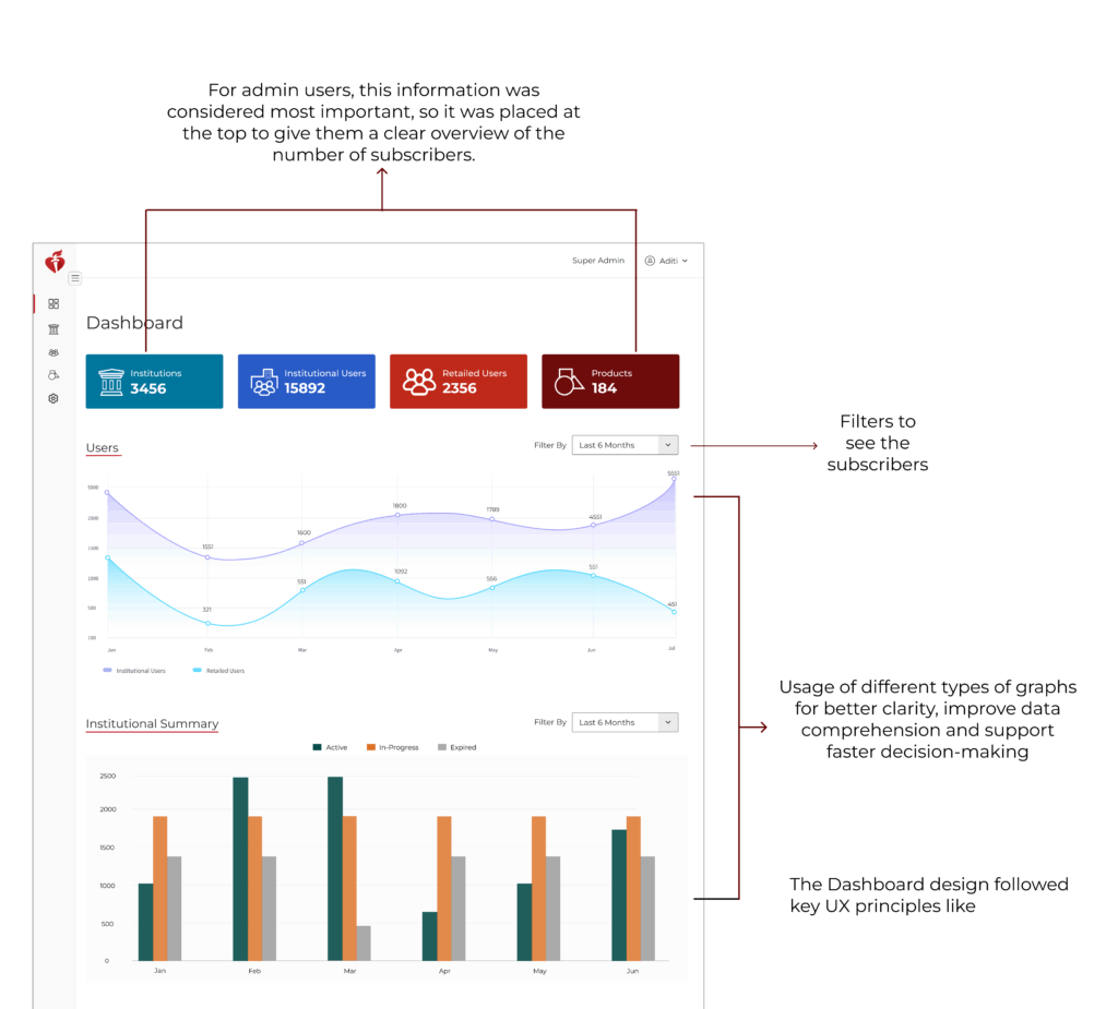
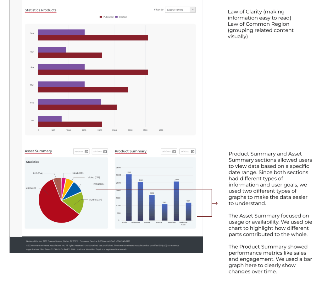
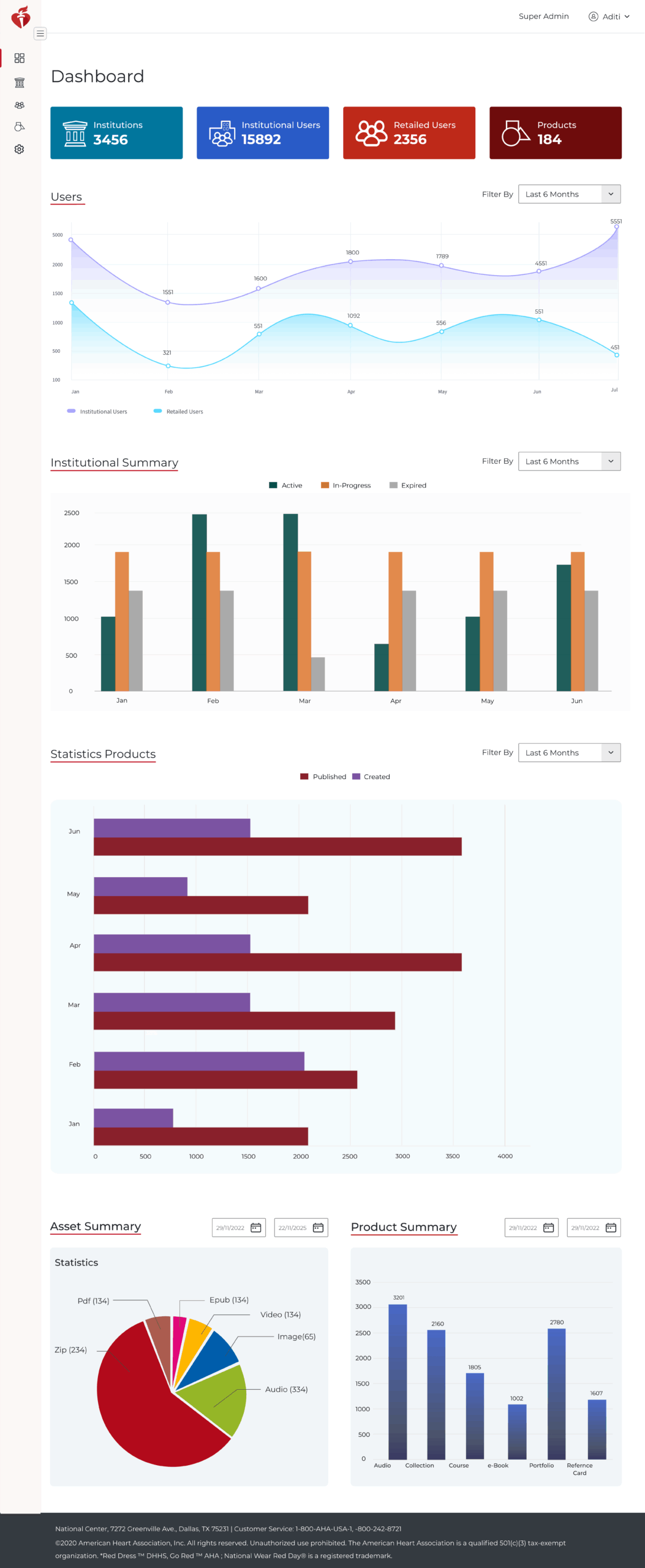
- The card-based layout won due to its clean organization and better data visibility.
Design Iterations Based on Feedback
- Improved filtering options for user lists.
- Added a search bar for quick access to specific admin actions.
- Introduced bulk actions (e.g., bulk user role updates).
Key Enhancements in the New Portal
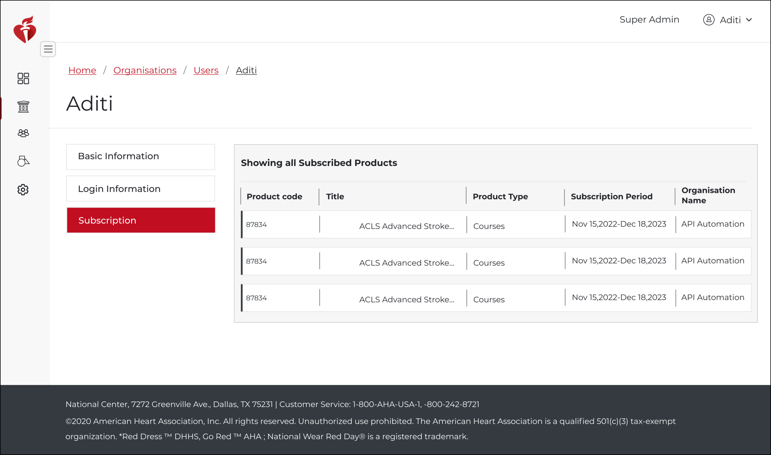
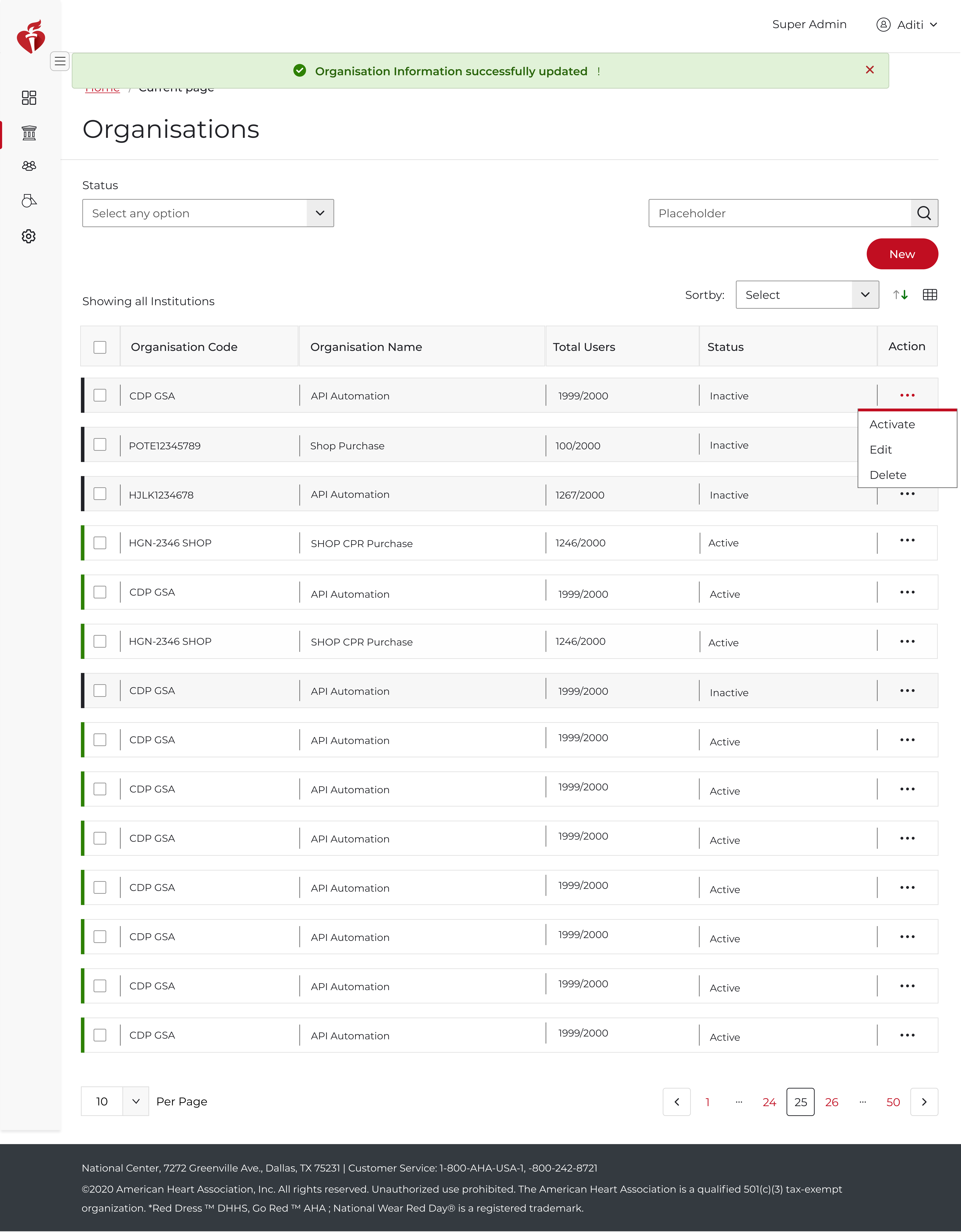
- Simplified User Management – Bulk actions, better role visibility.
- Intuitive Navigation – Flat hierarchy, easy-to-find sections.
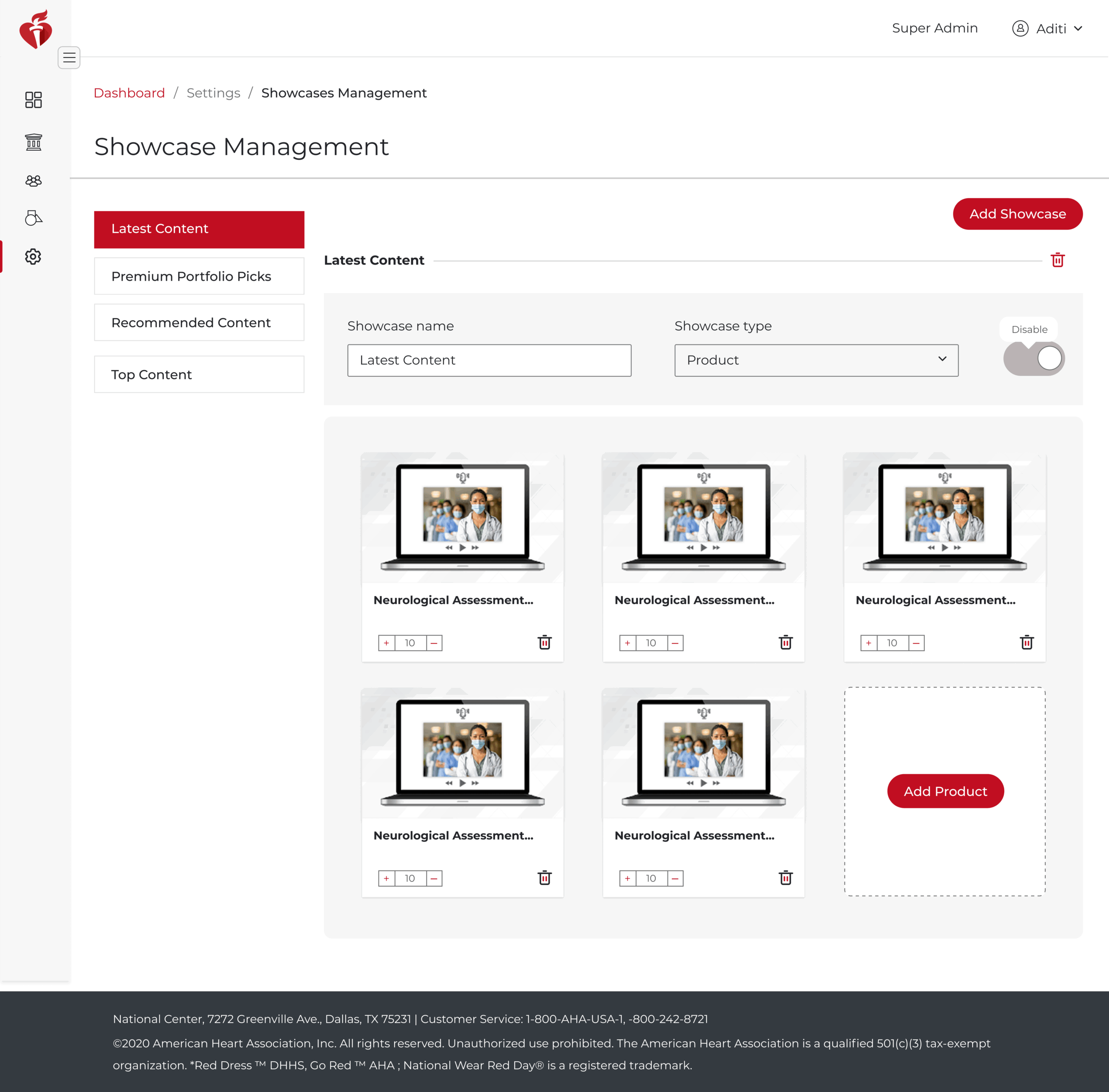
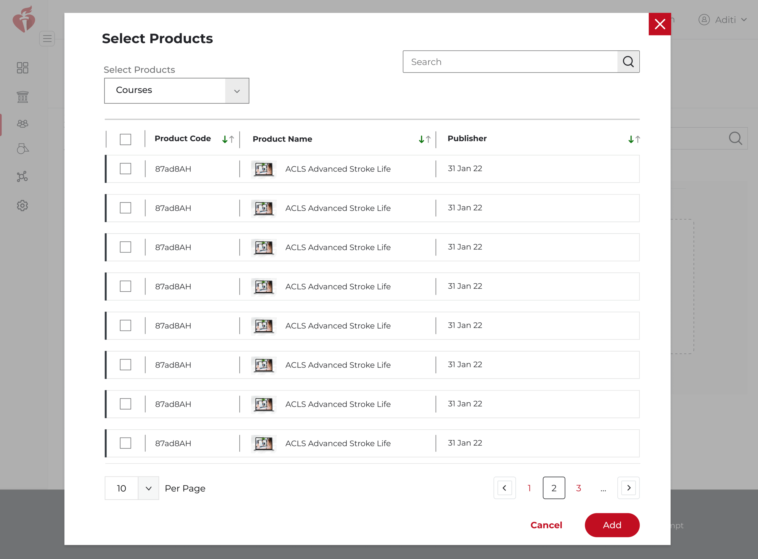
- Enhanced Showcase Management – Drag-and-drop reordering, preview mode.
- Improved Category Organization – Hierarchical structure, tag-based filtering.
Measurable Outcomes
30% reduction in admin task completion time (based on stakeholder validation).
📌 Final Thoughts & Learnings
- How to design UX solutions without direct user access – I relied on secondary research, heuristic evaluation, and stakeholder input.
- The importance of structured IA – Simplifying navigation improved usability.
- Balancing business needs with UX best practices – Ensured efficiency without compromising usability.
📌 What I’d Do Differently Next Time:
- Conduct analytics review (if data access is available) to identify user behavior trends.
- Push for indirect user insights from support teams or past research to validate assumptions.
📌 UX Methods
- Stakeholder Interviews
- Wireframing
- Prototyping
- A/B Testing
- Accessibility Auditing (WCAG)
📌 Tools Used
- Adobe XD
- Google Analytics
- Confluence
- Miro
Conclusion
This project was a great exercise in data-driven UX design, where I leveraged heuristic evaluation, stakeholder collaboration and design thinking to solve real admin workflow problems. The redesigned Super Admin Portal now provides a more efficient, user-friendly and structured experience, benefiting both the admins and the organization.