AUI Design
Design System
AUI Design System — Case Study from the Organization — American Heart Association (Heart.org)
This case study highlights how I led the design team in creating an updated design system for the American Heart Association. We recognized the need for a revamp and identified gaps in the user experience. Our goal was to build a design system that ensures consistency across all engineering, design teams, and products. The components we developed were successfully implemented across various AHA applications, streamlining design and improving usability.
Hima Chandrashekaraiah Prabha
Introduction
The American Heart Association (Heart.org) is a recognized organization dedicated to fighting cardiovascular diseases and stroke, aiming to build a world where people can enjoy longer and healthier lives. As a leading force in heart health research, education, and advocacy, AHA aims to eliminate heart disease and stroke through innovative advancements and widespread awareness.
My Role
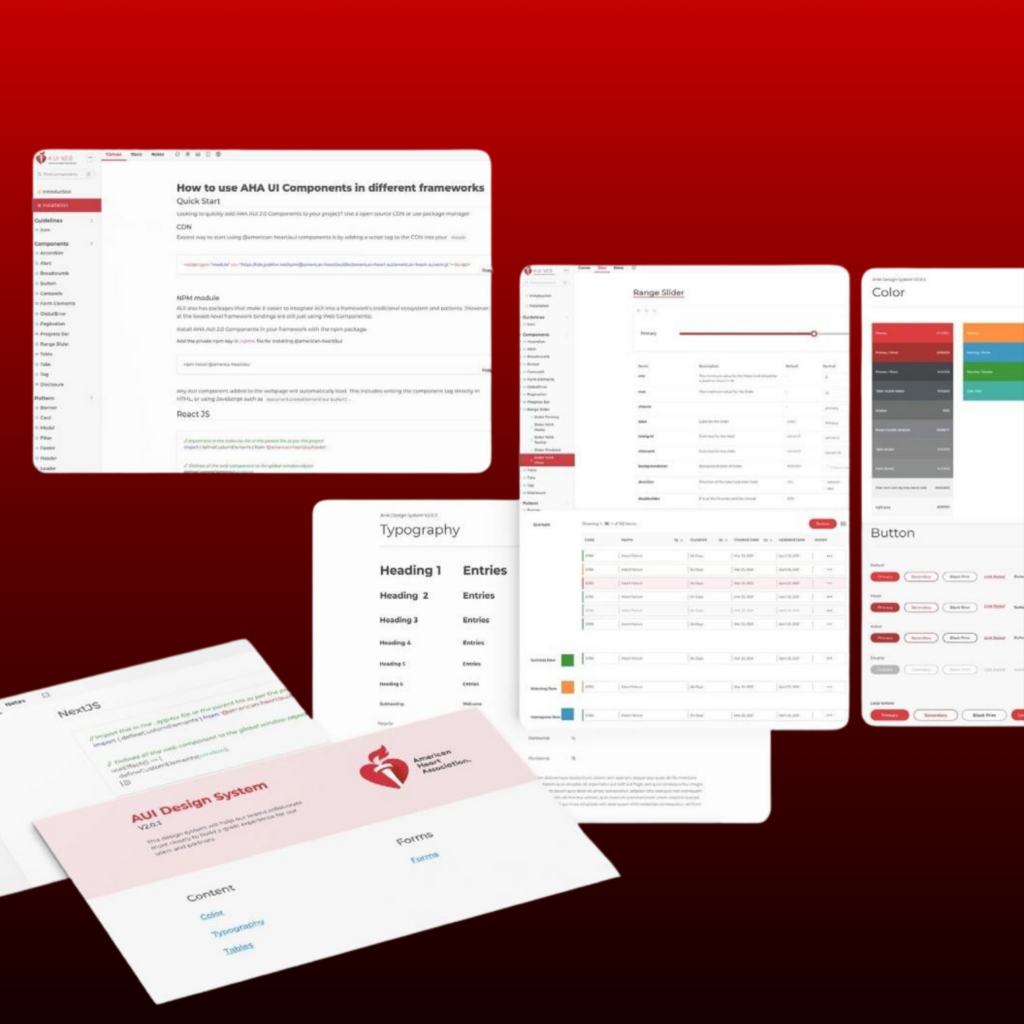
As a Senior User Experience Designer, I took on initiatives and responsibilities to develop with a strategic objective of introducing a revamped AUI design system v2. Additionally, a significant goal for my team was to make a part of this design system publicly available. To give a seamless experience for our esteemed customers, particularly developers, to facilitate the creation of digital products and platforms through effective collaboration to enhance consistency and efficiency across our products.
Responsibilities
- Research and design
- Building and managing the design system
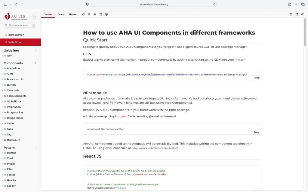
- Setting up a new design system web application
- Closely working with the product team to define the road map, plan and execute the design.
- Drive ideation workshops and design showcases
- Monitor design delivery
Problem
Challenges due to inconsistencies in design elements, outdated interface components and scattered resources across team departments and projects. This made it complex to achieve consistency and efficiency in the processes, ultimately hindering the progress and success of projects within the organization.
Research
How reusable components help developers and designers construct coherent applications.
What is the Reusable Components library?
Components stimulate the development of advanced applications. Besides being user interface elements that shape the experience for your users, they are also reusable and modular code units that should often be used in multiple projects.
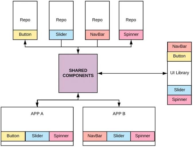
When we start diving into the world of building a shared component architecture for our organization, we end up having to figure out some tough questions, such as how to develop components independently but avoid the overhead of too many repositories, how to version, publish and manage each component individually, how to help others discover and adopt the components and so on.
This case study explores important topics like developing components in a single repository (monorepo) and managing components across multiple repositories. We’ll look at useful tools and workflows that help in developing, sharing, and adapting components across different projects.
Why are Component libraries important?
Utilizing component libraries can lead to standardized development, reduced code duplications, improved team collaboration, and increased scalability. As these factors greatly impact project deliverables and team motivation, selecting the appropriate solution that meets your requirements is crucial.
How are Component libraries saving time and money?
A component library is a code-based representation of a brand’s digital appearance and behavior across various platforms, such as web pages, applications or services. It uses a digital style guide to create a unified design system, the ultimate reference for designers and developers.
Components can be small and independent, such as buttons or form fields, or larger and more complex, such as a hero or footer. Regardless of size, all components serve a purpose beyond visual representation, as they are integrated with developers’ HTML, CSS and JavaScript. This integration enables content to be reused across different products or services within the brand, saving time and ensuring consistency and quality across all platforms.
Problems we faced?
Our principal challenge across platforms pertained to the inconsistency in the appearance of web and application-based interfaces and UI designs. Despite serving a common client, developers and designers working on various projects under unified banner created elements in varying styles and configurations. This presented a considerable obstacle for us, as we faced several issues upon developing components, including inconsistent padding, margins, button sizes, table designs, spacing between elements, link styles, divergent font sizes and families, and varying page layout structures.
Many organizations, including ours, face difficulties guaranteeing that our web and mobile applications meet accessibility requirements. Ensuring that HTML code is written per the WCAG accessibility standards is critical. Nevertheless, one of our most significant challenges is our developers’ varying knowledge and expertise.
Some may possess only a rudimentary understanding, while others demonstrate exceptional aptitude with a comprehension rate exceeding 80%. This can hurt the development of certain components, potentially yielding end-user deliverables that fall short of market standards.
Who are the users?
Primary users will be the designers and developers who directly work on creating and implementing digital products and experiences.
Secondary users will be other team members who may not directly work on design or development but still benefit from the design system.
How does one create a Design System for a large organization with large- scale products and services?
Even though I used the design systems for my projects, this was my first project to work on an actual design system. I started this project with research. Browsed all around the web, including medium articles and guidelines. I referred to top-notch and elite design systems by Google, Meta, Apple, IBM, Airbnb, Atlassian, Ant Design etc. I checked with other designers who faced similar challenges.
- Why do we need one and an updated one?
- What problems do we solve with this?
- Why are we building this?
- What does success look like? (for our customers, teams, the business, etc.)
- What is the scope of this project?
- Who is this for?
Goals
Based on the research, I captured these goals for all stakeholders, which became a point of direction for the project.
Developers (Customer Side):
We need help building widgets and marketplace apps seamlessly integrated with the product, resulting in inconsistencies in the user experience.
AHA Developers:
We want to develop applications with a unified system, ensuring a consistent look and feel across our products.
Developers (Engineers):
We need to identify common components, leading to redundant efforts and time- consuming development tasks.
Designers (UX Designers):
Bridging the connection between designers and maintaining a consistent user experience is challenging, and staying updated with changes/additions to components is unmanageable.
Inconsistency
Our product has several inconsistencies, including colour contrasts, components, guidelines, and broken CSS codes, which can negatively impact the overall experience and brand image.
Redundancy
As a designer, not having a component library means doing repetitive design work to create your product screens. The same applies to implementation, as developers would have to spend more time and effort creating new components.

Insights from end users
“Can you explain why the titles of the fields have varying font weights and paddings?”
Pamela Frost, AHA
“In certain locations, the primary buttons feature an icon while in others, they are different.”
Sachin Kumar — Front-End Engineer
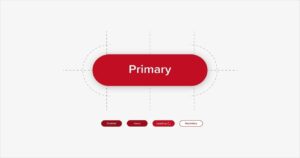
Rigidness
There is no clear hierarchy for buttons or structure for the various component states used across platforms.
Communication
Maintaining and scaling the design system can be challenging, and good communication among designers is crucial. Before modifying an existing component, it’s important to research its usage across various use cases.
Accessibility
To cater to a diverse user base, including those with visual, auditory, and motor impairments, we must ensure our product is inclusive and accessible for everyone. This is essential as millions of people use our product from all around the world.
Design process
We formed a team of designers and engineers to establish a clear structure and guidelines for our components. Our main goal was to create a set of elements that could work together seamlessly within a larger system. After researching different approaches, we decided that the Atomic Design methodology would be a strong foundation for our system.
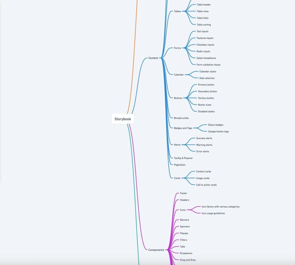
Information Architecture
We used whimsical to list the components used on our platforms and organized them into an initial structure of atoms, molecules, and organisms.
We started with atoms, the minor units that will be the foundation for our design system: typography, colors, icons, buttons, form inputs, labels and badges, links
Evaluation
Working on our design system has been challenging, but it has resulted in numerous positive benefits for the company across various levels.
Development
This makes life easier for developers by allowing them to speak a common language with the design team when discussing implementations. The focus is on the features rather than low-level UI elements like color and space values, small components, interactions, and states.
Experimentation
- By utilizing the design system, we could rapidly construct prototypes, explore more ideas, swiftly assess our assumptions and generate additional variations to conduct A/B testing as well.
- For the users (customers who are developers and work with other frameworks)
- Develop widgets, extensions, integrations and marketplace apps that seamlessly integrate with the main app and offer a consistent user experience.
My Learnings & Takeaways
- Despite not being experts in building design systems, the design team has gained valuable experience tackling this issue. We have faced multiple challenges, resulting in our soft and hard skills improving.
- Making changes to components requires more effort. We have created a dedicated teams channel to ensure effective communication regarding design system alterations.
- Everyone must be on the same page and work cohesively as a unit to function effectively together. The developer’s storybook and the designer’s design system must sync.
- Although the system can sometimes be limiting, as its defined patterns bind us, it can also act as a tool to improve interaction.