Professional Education Hub
Product Design
User Experience Design
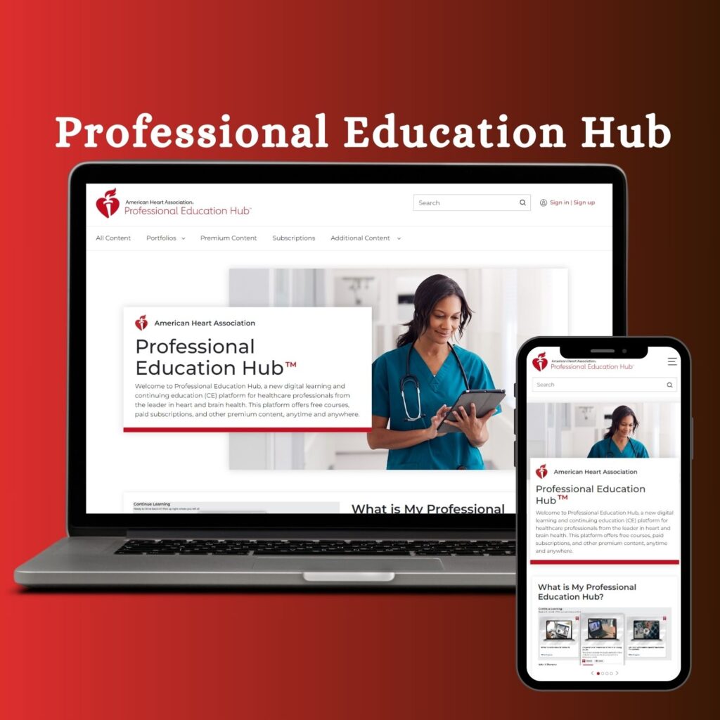
Professional Education Hub— Case Study from the Organization — American Heart Association (Heart.org)
This UX case study focuses on revamping education.heart.org, an established web platform that faced significant UX challenges. The previous version of the platform encountered usability issues, hindering users from quickly accessing life-saving resources and purchasing paid course, training materials and other products.
Recognizing the importance of delivering an intuitive and seamless user experience, the business made a strategic decision to undertake a comprehensive revamp of the web application. This case study explores the critical challenges faced by users, the design process implemented to address these issues, and the resulting improvements that enhanced the overall usability and effectiveness of the Professional Education Hub platform..
Hima Chandrashekaraiah Prabha
Introduction
Professional Education Hub is owned by American Heart Association (Heart.org), a non profit organization Founded in 1924 in the United States that funds cardiovascular medical research, educates consumers on healthy living and fosters appropriate cardiac care to reduce disability and deaths caused by cardiovascular disease and stroke.
Goal
Improve Engagement & Conversion
- Make it easier for users to explore, find and purchase courses.
Enhance Accessibility & Usability
- Ensure WCAG compliance and intuitive navigation for users of all abilities.
Optimize Course Discovery
- Implement smart filtering, categorization, and recommendations.
Refine Course Detail Pages
- Provide clear and structured course descriptions and subscription info.
Problems Identified
- Low conversion and high drop-off during course purchases.
- Poor mobile usability and inconsistent responsive behavior.
- Accessibility issues for users with disabilities.
- Cluttered information architecture, particularly on course detail pages.
- Confusing filtering and search mechanism for paid vs. free courses.
Our Proposal
Instead of using confusing existing web apps, we will enhance the user experience by organizing the layout to meet AHA standards for accessibility across all responsive screens. By ensuring accessibility compliance, we will make the platform more inclusive and user-friendly for individuals with different abilities. This will be achieved while maintaining the consistency of the American Heart Association design system, ensuring a cohesive and familiar experience for users.
An intelligent recommendation system that suggests new products to users in an organized and relevant manner. The platform will provide personalized product recommendations by leveraging user data and intelligent algorithms.
Our goal is to create a seamless educational platform that empowers users to quickly find and access vital resources. By enhancing accessibility, offering personalized course recommendations, and enabling integrations, we strive to promote education and ultimately contribute to saving lives. Through this initiative, we aim to support the American Heart Association’s mission to improve health outcomes and equip individuals with the knowledge they need.
My role and team
I joined the project as a Senior UX Designer in collaboration with UX Manager, (UX Head Manager — American Heart Association), Principal UX Designer, Other UX Peers and the Research Team, Product Manger, Business analyst, Developers helped with this extensive research and executed the UX design process.
Topic research
During the topic research phase for the Professional Education Hub revamp, we analyzed user behaviour, industry best practices and market trends to gain valuable insights and identify areas for improvement in the existing platform.
How do people buy educational training courses currently?
- Mobile Learning Apps
- Social Media and Influencer-driven Learning
- Community-based Learning Platforms
- Online Learning Platforms
- Institutional Programs (Universities and Colleges)
- Individuals and organizations
- Bootcamps and Short-term Intensive Courses
Target user and market
Individuals and organizations seeking course materials and resources, including healthcare professionals, educators, trainers, and individuals interested in acquiring life-saving skills. The market encompasses many customers who prioritize
Scope
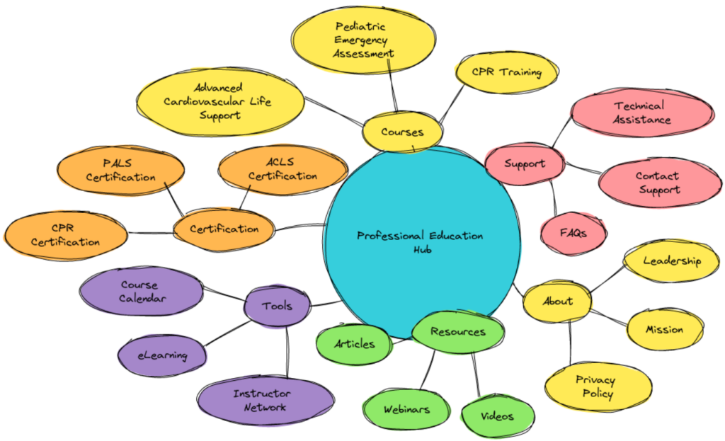
The Professional Education Hub by the American Heart Association offers flexible, self-paced courses for healthcare professionals, focusing on stroke care, heart health, resuscitation and telehealth. Providing CE credits, eBooks and certifications, it supports skill development and licensure maintenance globally, catering to hospitals, clinics, and independent practitioners following AHA guidelines
Themes and insights
Stroke and Cardiovascular Health: Focuses on enhancing stroke care outcomes and heart health with updates on the latest science and guidelines.
Health Equity: Offers courses to help healthcare providers address disparities and serve diverse communities effectively.
Telehealth and Digital Health: Provides training on telemedicine to equip professionals for remote care delivery.
Subscriptions and Premium Content: Includes access to specialized portfolios on stroke care, resuscitation and hypertension through subscription plans.
Potential Users Interviews
We targeted diverse potential users, including healthcare professionals, Healthcare Administrators, Telehealth Providers, Educational Institutions and Global Healthcare Practitioners.
By selecting this range of users, we aimed to gain valuable insights into their specific needs, pain points and challenges in accessing and purchasing products and resources. ultimately helping to tailor content to better meet the needs of its users.
Conducted initial field research.
sent a survey reports and Interviews

1
Healthcare Professional (Nurse)
Nurse: “Honestly, flexibility is key. I work shifts, and being able to pause and pick up where I left off—without losing progress—would be a game changer. Also, I’d love interactive quizzes that give instant feedback.”
2
Medical Student
Student: “I want to use the portal on any device since I mostly use my tablet and phone instead of a laptop. So it would be better if I have it on phone so that I can learn quickly.”
3
Telehealth Provider
Telehealth Provider: “I struggle with the filter section because it’s sometimes hard to find paid and unpaid courses. The options aren’t clear, and I often get confused while searching. A simpler, more organized filter would make it easier to find the right courses.”
4
Educational Institution Representative
Institution Representative: “ The course detail page looks cluttered and hard to read. It would be better with a clear layout and a well-structured description, making it easier to understand the course details at a glance.”
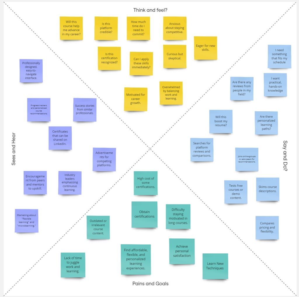
Empathy Map
After conducting interviews, we created an empathy map to gain insights into users’ emotions, experiences, and environment, allowing us to better understand their needs and perspectives.
Ideation + Validation
We developed concepts to solve the problem for the initial phase.
We tested our idea with the UX Head of the American Heart Association to know the sustainability and viability of the notions.
We inquired our 10 test groups to vote for the best idea.
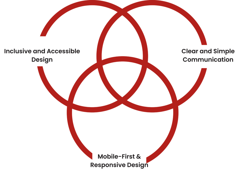
🧭 Design Principles
- Mobile-First Design
- Simple & Predictable Navigation
- Minimal Distraction – Clean UI
- Accessibility-First – WCAG 2.1 AA
- Smart Personalization
Design Critic & Feedback
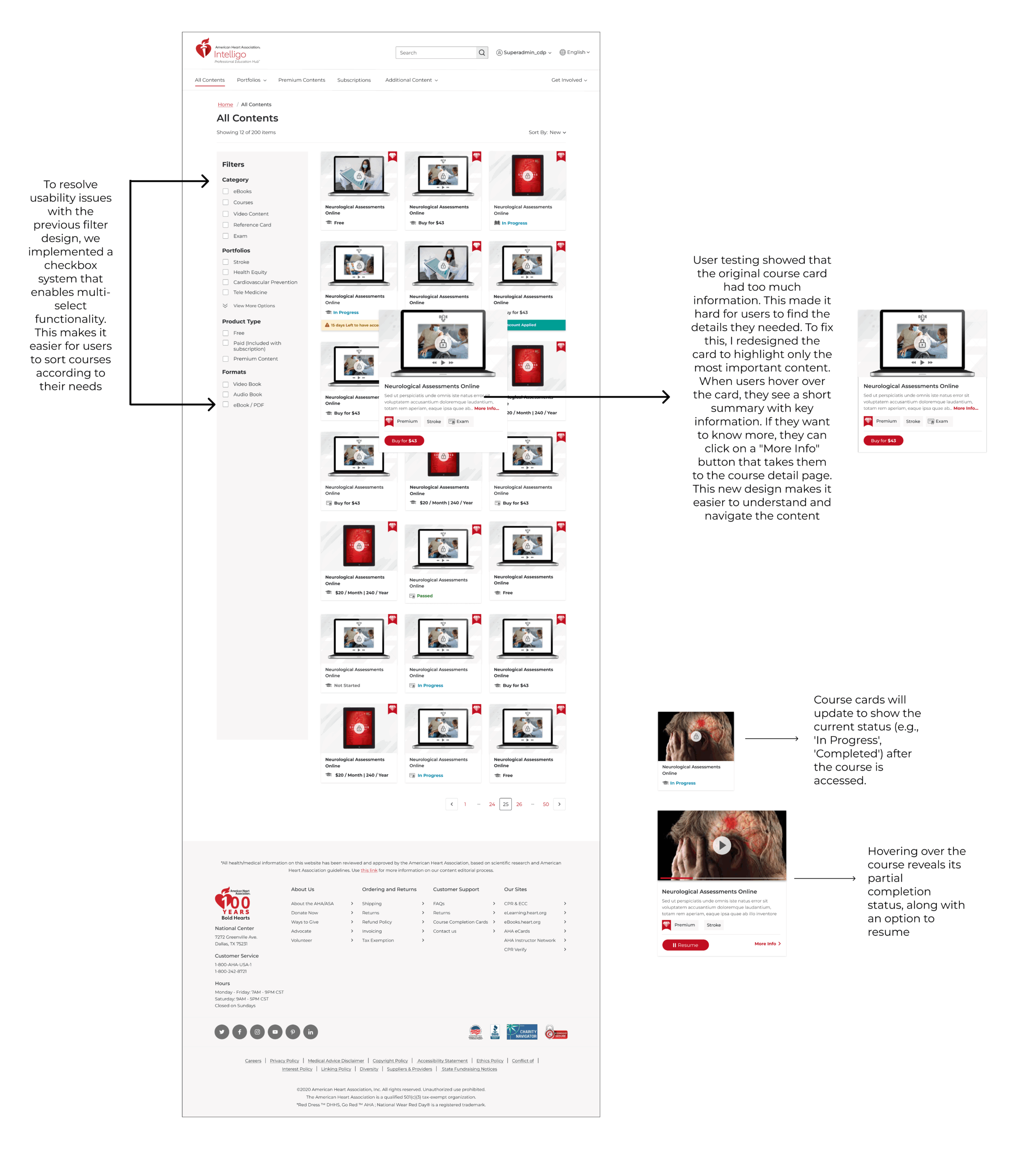
Considered carousel layout but opted for a grid-based design for better accessibility and user experience.
Simplified the navigation menu for improved user experience and faster task completion.
Originally considered using extensive animations and transitions, but opted for a more subtle approach to maintain page loading speed and overall user satisfaction.
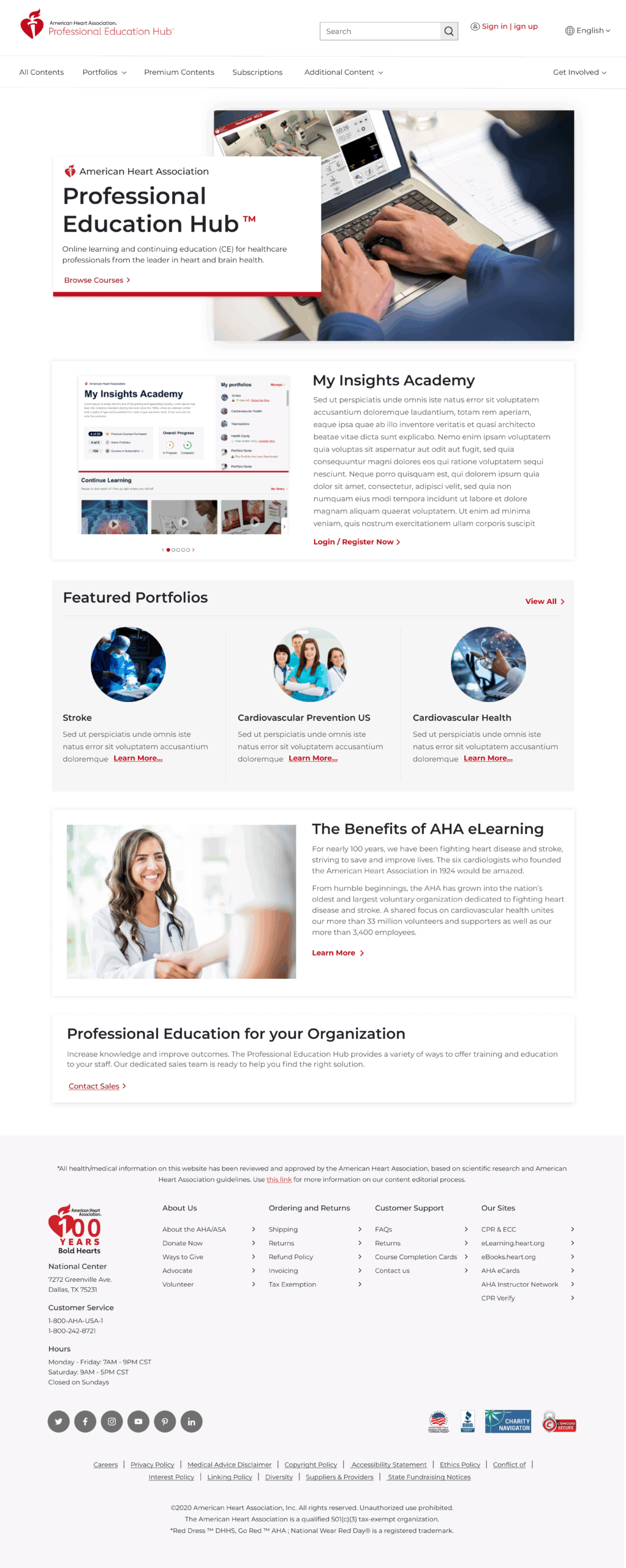
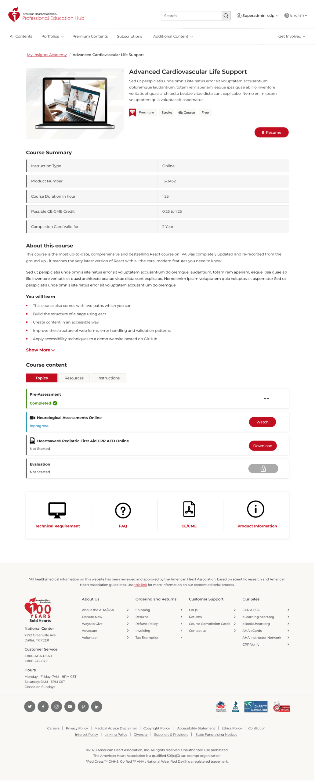
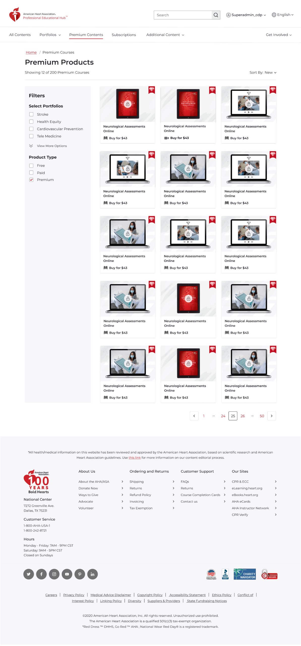
Final Designs
📌 Impact & Outcomes
- WCAG-Compliant Accessibility: Opened doors for broader user demographics
- Improved Engagement: Higher returning user rate and retention
- Secured: Improved metrics helped justify additional project funding
- Mobile Optimization: 50% increase in mobile engagement time
📌 Reflections & Learnings
- The value of cross-functional collaboration in achieving UX consistency
- Importance of early accessibility planning to avoid retrofitting
- Power of user validation asking the right questions, observing real behavior
- How design can support a mission beyond products – in this case, saving lives
📌 UX Methods
- Stakeholder Interviews
- User Interviews & Surveys
- Empathy Mapping
- Wireframing
- Prototyping
- A/B Testing
- Accessibility Auditing (WCAG)
📌 Tools Used
- Adobe XD
- Miro
- Google Analytics
- Confluence
Conclusion
The redesign of the Professional Education Hub transformed a fragmented user experience into an accessible, responsive platform. Our focus on research-driven UX decisions ensured the final product met both user needs and the AHA’s mission to save lives through education.