Think Green Dublin
Web Design
Branding
Think Green Dublin — Case Study
Green Dublin is set up to provide an extensive collection of information on sustainable practices and environmental challenges. The website offers a wide range of content on important subjects like waste reduction, renewable energy, climate change, and sustainable transportation. This content includes articles, videos, podcasts, and infographics. Green Dublin seeks to increase the awareness of environmental issues and potential solutions among its citizens while also encouraging eco-friendly behaviours. Because of the platform’s multifaceted approach, users can learn at their own pace and in accordance with their interests, which makes education inclusive and flexible.
Hima Chandrashekaraiah Prabha
Aim
The Green Dublin online platform aims to educate the public with accessible and engaging content on environmental issues and sustainable living. It promotes sustainable practices among Dublin residents through practical guides, interactive tools, and gamification, Additionally, it supports local green businesses by highlighting and promoting services that support sustainability through a dedicated local green directory.
My Role
UX Researcher | UX/UI Designer | WordPress Developer
Led the end-to-end process, including user research, wireframing, interface design, brand identity development and full-stack implementation using WordPress.
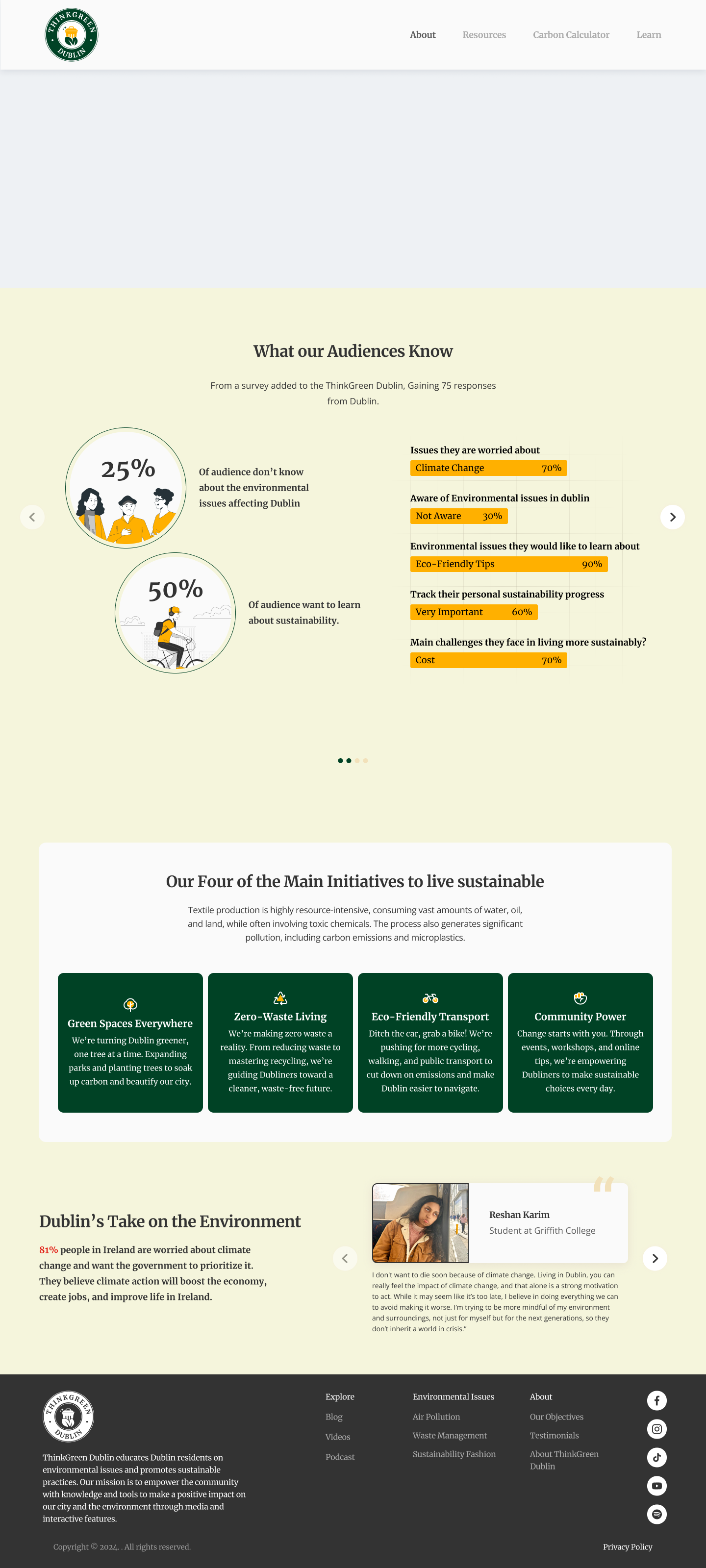
UX Research
- Stakeholder interviews
- Online surveys (n = 72)
- Competitor analysis
- Contextual inquiry (local sustainability groups & events)
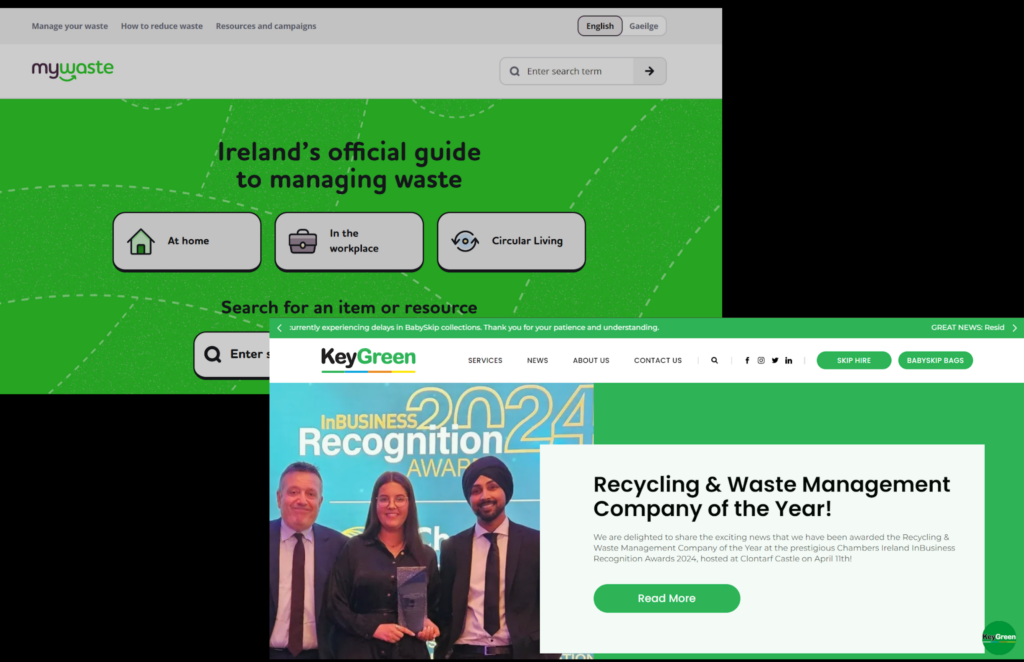
- Usability benchmarking of similar websites (MyWaste, KeyGreen)
Key Insights
Users want localized, actionable advice over generic content
Most were unaware of local green businesses
Over 60% said they struggle to trust sources on sustainability
Tools like calculators, sorters, and reminders increase engagement
Younger demographics preferred gamification and mobile-first experiences
Problem Statement
Pollution is rising in Dublin. People care but struggle to act due to scattered information.
We needed a unified platform with local, actionable content.
Vision Statement
A connected, easy-to-use platform that helps people live greener lives.
Think Green Dublin simplifies sustainability, bringing resources and the community together.
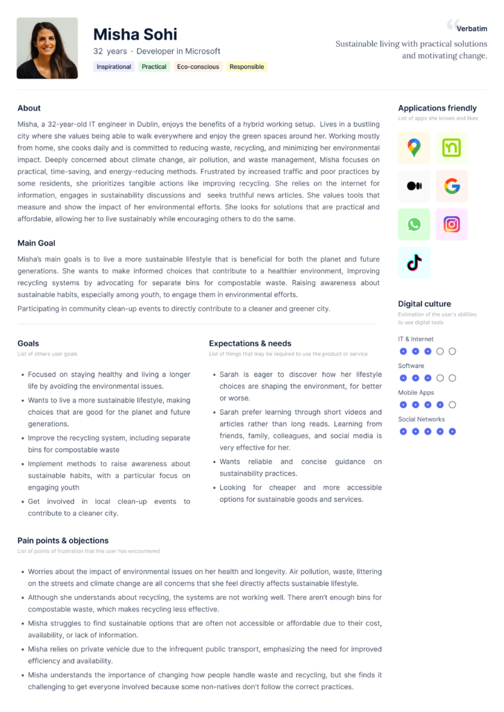
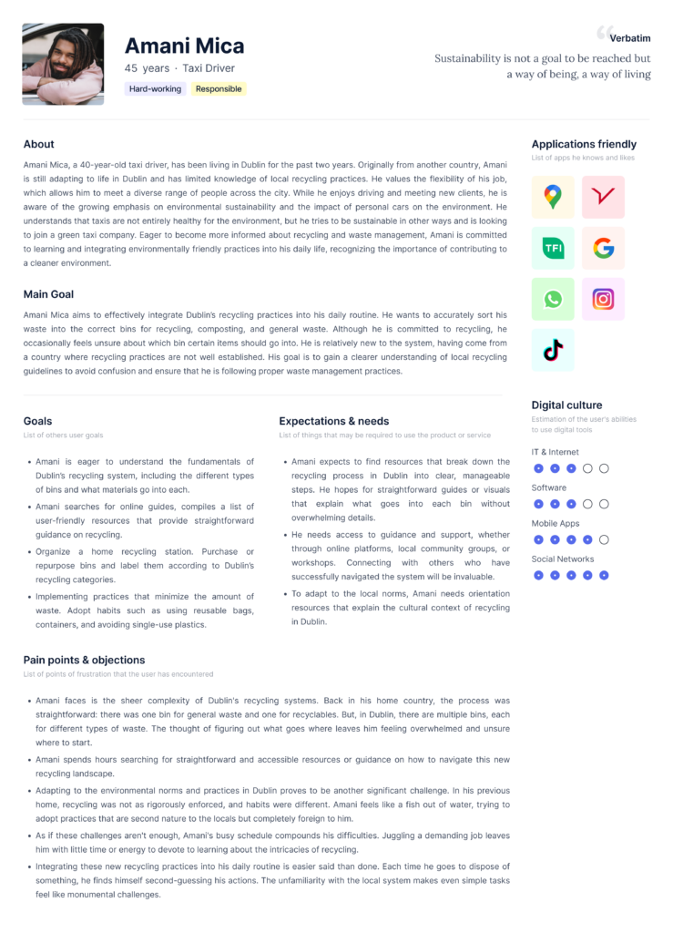
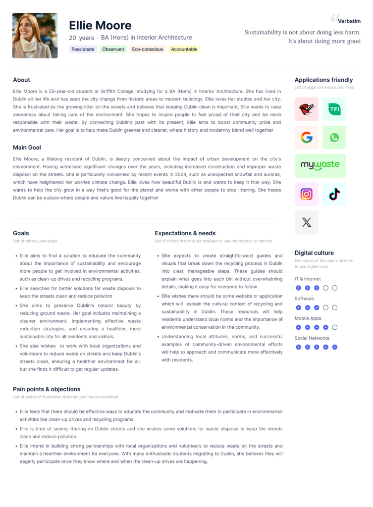
Persona
To ensure that Green Dublin effectively addresses the needs and concerns of the community, we implemented a comprehensive research strategy targeting a broad demographic of Dublin residents aged 18 to 65.
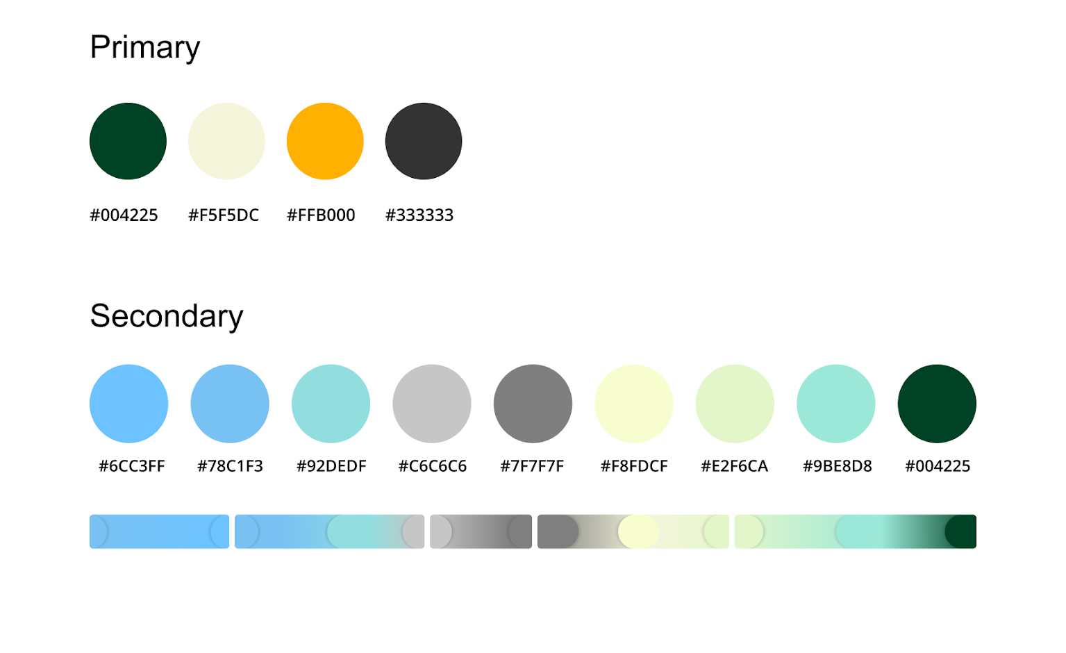
Design Language Guide
Deep Green #004225
– Symbolizes nature, growth, and eco-conscious living
– Represents our commitment to sustainable practices
Soft Beige #F5F5DC
– Evokes calm, balance, and simplicity
– Highlights the ease and peace of living sustainably
Vibrant Gold #FFB000
– Adds warmth, optimism, and energy
– Represents a hopeful, action-driven future
Charcoal Gray #333333
– Brings clarity, contrast, and professionalism
– Grounds the palette and ensures readability
Logo
Logo & Naming Rationale
The name “Think Green” communicates a clear and intentional message of sustainability and environmental awareness.
- “Green” symbolizes nature, growth and eco-conscious living—perfect for a platform focused on reducing carbon footprints and promoting sustainable habits.
- “Think” encourages a mindful, proactive approach, aligning with the platform’s goal of empowering users to make better choices for the planet.
Together, the name reflects both the mission and mindset behind the platform.
Logo System:
- Designed for versatility and clarity across light and dark backgrounds
- Minimal, nature-inspired aesthetic to complement the clean, informative tone of the site
- Adaptive design ensures readability and brand consistency across desktop and mobile devices
🌿 The logo is more than a mark—it’s a visual commitment to a greener, smarter Dublin.
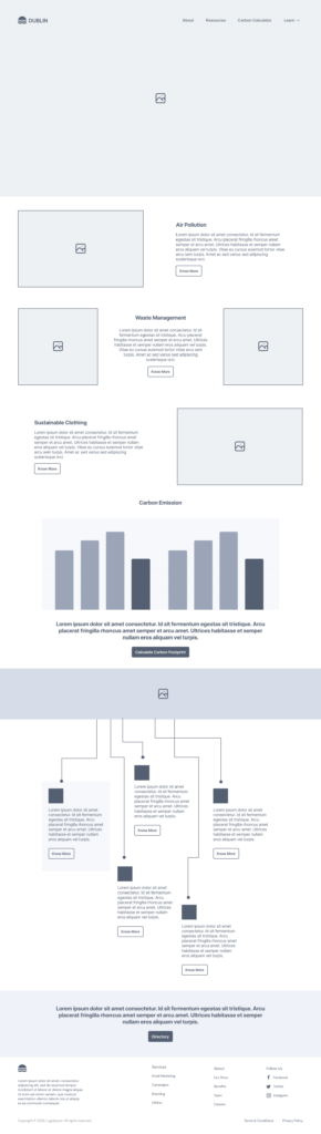
Wireframes
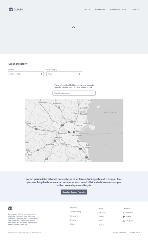
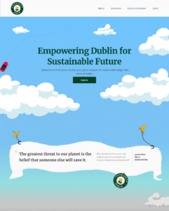
Final Designs

My Learnings
This project helped me understand how important coding skills are for UX designers. If a design can’t be implemented, it loses its value. After this project I feel more confident about how things are built. I got to handle everything from research and ideas to design and development. Owning the whole process gave me a clearer view of how UX decisions shape the final product. I also learned new tools to bring my ideas to life.